We’ve all seen major brands do the re-branding thing, shuffle the logo tagline, in order to make a fresh splash. And sometimes, you have to wonder, what are they thinking?
The case that just comes to mind is the striking similarity of the current refresh of the Pandora brand identity to the PayPal. It’s just a little strange to me how very similar the P in new typographical logo for Pandora looks to the P in the PayPal icon. If you’re going to rebrand, then make it unique, make it memorable.
![]()
You have to ask, is it your brand, or are you just following trends? First Google dropped their serif font logo, in favor of sans serif…Yahoo dropped the serif, Uber rebranded, now Pandora is going sans-serif as well? I think it’s muddying the water a bit. The other day I was on my phone and I meant to open Pandora, but I ended up opening PayPal by accident, and one time vice versa.
And I think it’s a little understandable that brands this young go through some growing pains. But strategic identity is about creating something iconic. When has Nike rebranded? GE? Mercedes? These iconic brands have stayed true to their logos, and continually embellished and refined their brands, rather than swapping them out.

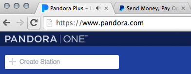
And then there’s the product positioning…look at the screen shot from Pandora…am I listening to PANDORA | ONE, or Pandora Plus? And then why the serif logo, and ONE in all caps…but the new icon in the tab? Why one UI on the phone, one on the computer device, then a third look when you chromecast to your home sound system? Why doesn’t the lowercase “p” in the new logo match the favicon shape and the typographical lowercase logo? Pandora, I still love you, because your tech and concept is strong, I know you are just going through growing pains. I actually like the lowercase sans-serif logo and lighter blue…I just don’t think the filled in capital P is appropriate for your icon, given that PayPal has used that style for a lot longer.
Read more on this at Advertising Age here:
http://adage.com/article/digital/pandora-debuts-logo-digital-campaign-push/306241/


